Using a few letters and Illustrator, combine them in a way that they form a picture. I asked my friends to give their opinions on the designs. Here is the result:
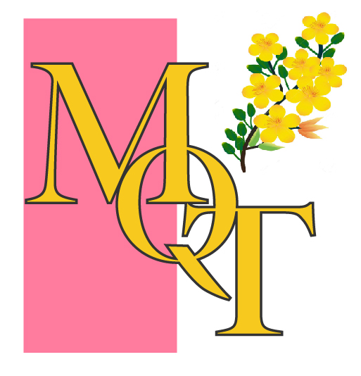
Ligature with flower
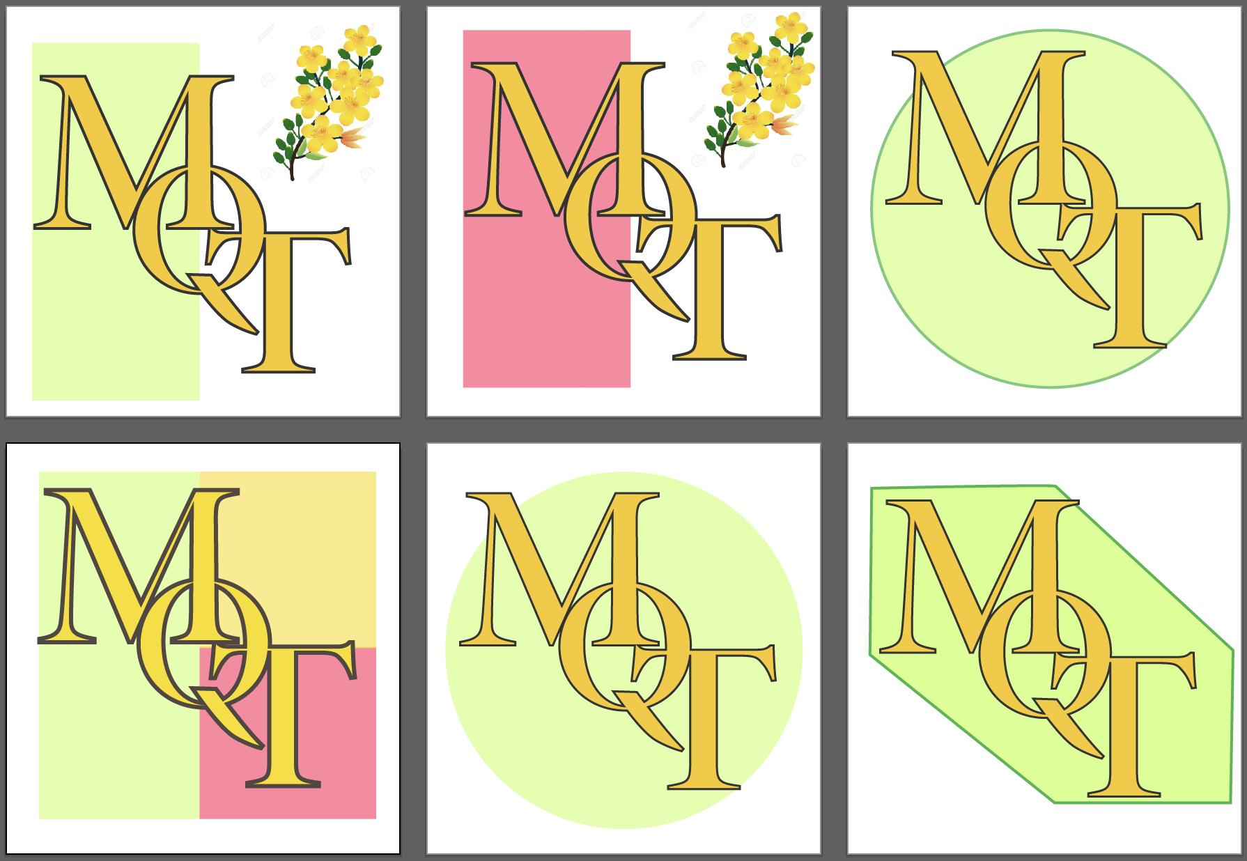
The second most liked ligature. The reason I added the flower is because my name means that flower in Vietnamese. It is called mai vang(yellow mai). Originally, I had the red background span the entire background. After second thought, I made it half, and inserted the yellow mai flower at the top right. A lot of my friends think this is a good design. However the flower was edited with Photoshop, so zooming out makes it look pixelated, and I could not remove the white box around the flowers, either.
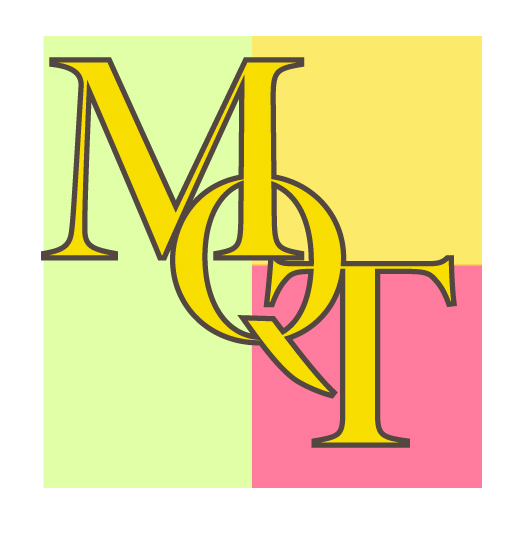
Ligature with colors
The most liked ligature. A lot of my friends like it for the simplicity. The combination of just colors makes the picture printable on all sizes. At first, I was hesitant with using red color as the background for yellow text. However, after reducing the opacity to 60%, I got a very satisfying pinkish red color! It was the perfect background for yellow text. Same goes for green color. The original idea was the yellow flower with its green leaves. However, it was hard to find a good whitish green, so I had to fiddle with reducing opacity. The picture turned out great regardless.
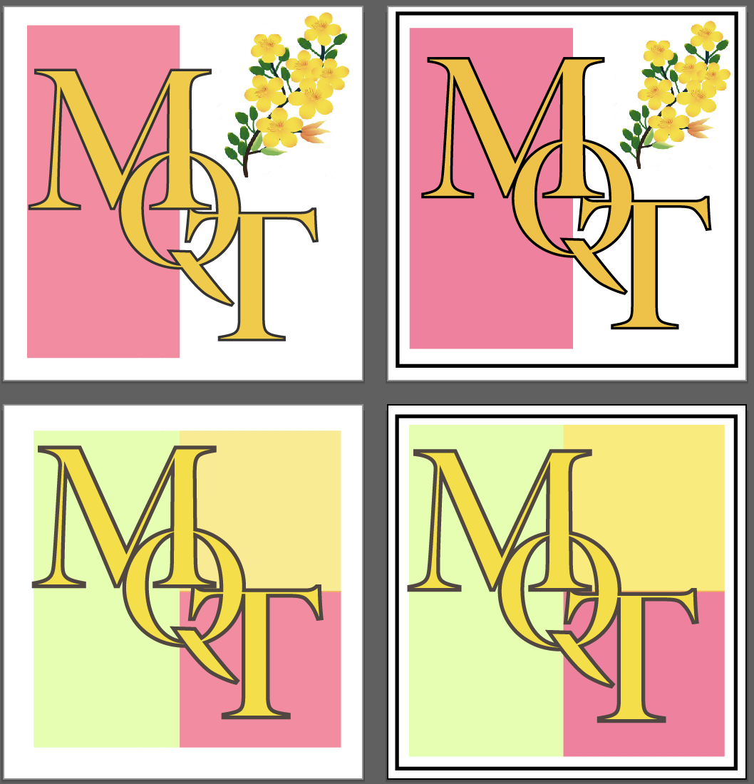
To border or not to border
Would the top 2 favorite ligatures look better with or without borders? I think they look wonderful without borders!
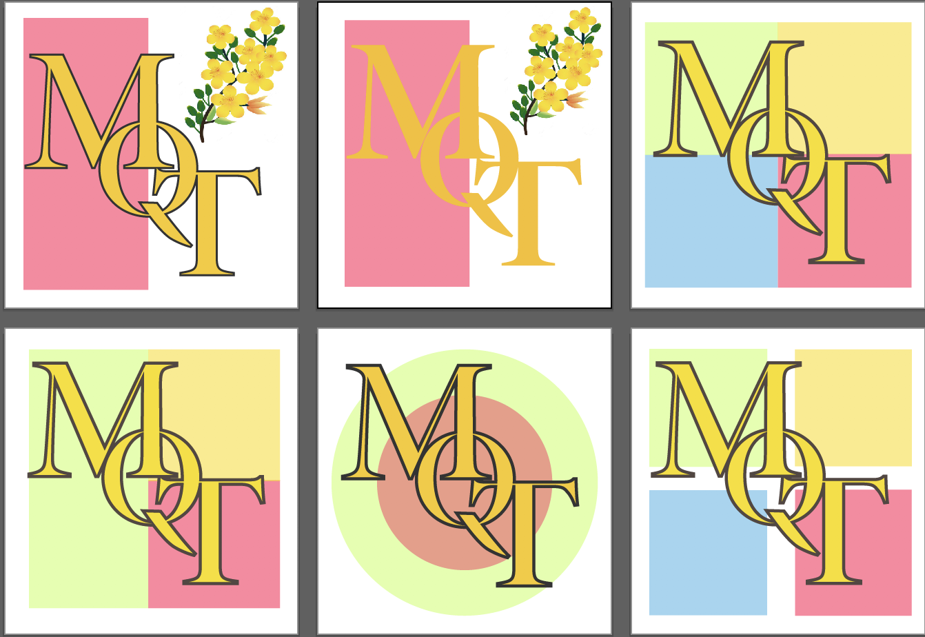
Color variations
I was trying out different color patches. Since the letter’s color is yellow, green, red and blue are perfect background colors since they contrast well with yellow. The last logo with four colors looks almost like Microsoft famous logo; however, I did not think about it when I chose colors, I only realized after. I also tried removing letter stroke in the second logo.
Shape variations
I was trying out different shapes for the background. Would my ligature look better on a circle, a half rectangle, or a polygon? Would the background stand out more with one single color or multiple colors? Does adding border makes the background more distinct? They were the questions I asked myself during the design.